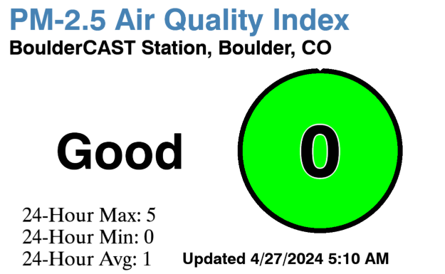
We show a lot of model forecast maps here at BoulderCAST. They offer much more than just pretty colors. Complex weather models, like the GFS and Euro, generate staggering amounts of data in four dimensions (3-D space, plus time) for the entire Earth. Interpreting all that data to make an accurate forecast is a bit like piecing a puzzle together…while blindfolded, and without thumbs. Weather maps allow forecasters to visualize the model data in focused and convenient ways, making them our best tool. We briefly discuss how to first approach these maps.
Alright, let’s take this slow. Depicted below is a 500 mb geopotential height and vorticity map from the GFS model, something we show fairly often, since it provides a great “overview” or “first-look” at the large-scale weather set-up, with troughs and ridges clearly visible.
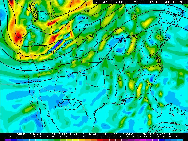
Let’s start by dissecting the information contained in the text, as this will give you insights about which specific data the map contains. Shown below is the same image, but now with numbered labels, each of which is discussed and detailed below the image.
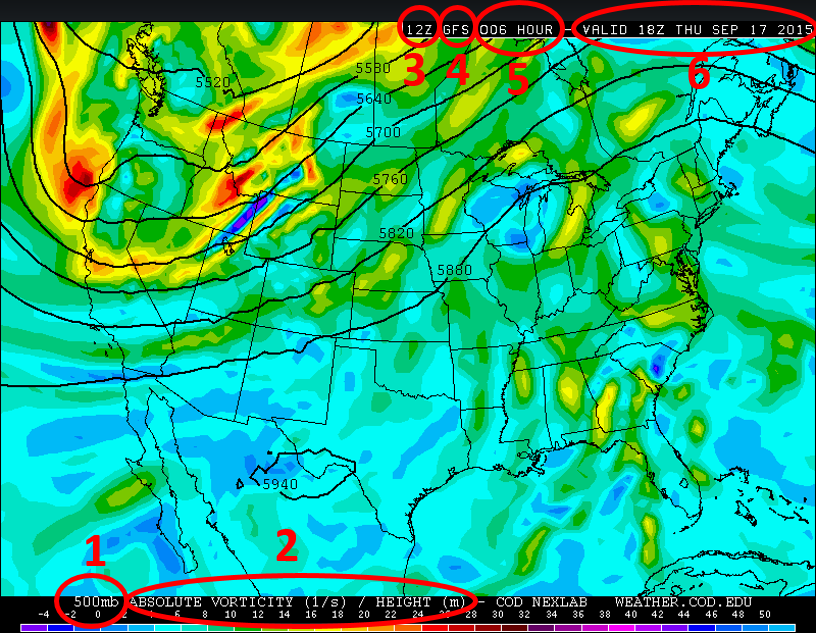
- PRESSURE LEVEL: First displayed is the pressure level the data is for; in this case, 500 mb. Pressure levels may seem confusing or outlandish, but just think of them as a specific “level” in the atmosphere. The 500 mb level is the point in the atmosphere where the pressure is 500 mb. If there is a high pressure system, this level will be physically higher above ground. If there is a low pressure system, the 500 mb level will be lower. Meteorologists use pressure levels, instead of just normal heights, because air tends to move along these surfaces.
- DATA FIELDS: Also contained in these labels at the bottom are the parameters being plotted on the map and their units; in this case, that is absolute vorticity (in inverse seconds) and geopotential height (in meters). Specific data fields that are complimentary in nature are often plotted together. For this example, geopotential height contours (black lines) tell about wind speed and direction, which combined with vorticity, gives the forecaster an idea of vorticity advection, a key variable to determining large-scale atmospheric lift. Heights are always contoured black lines, while the other parameter is often color-contoured. You can use the color bar at the very bottom of map to decipher the intensity.
- MODEL INITIALIZATION TIME: This label shows the time that the model started at, in Zulu time (Zulu time is GMT, which at present is 6 hours ahead of Mountain Time). The model uses observations from around the world and begins crunching the numbers at the time denoted here. The GFS and NAM are run four times per day, at 0, 6, 12, and 18Z. This particular model was initialized at 12Z (which is 6am MT).
- MODEL: This just shows which model’s data is being plotted. In the above case, it is the GFS model. All models are different, performing better for various types of weather than others. It is useful to know which model you are looking at, so you can mentally correct for known model biases from experience.
- MODEL HOUR: This next value shows how far out in time the data is on the map, in hours. Remember, models represent future weather. This value tells you instantly how many hours out from the initialization time the current map is. In this case, the model hour is 006, or just a 6-hour forecast from the time the model was run. We trust the data on this map much more than a map at model hour 240 (10 days out)!
- TIME VALID: The final number up top shows the precise time (in Zulu time) and date where the forecast map is valid.
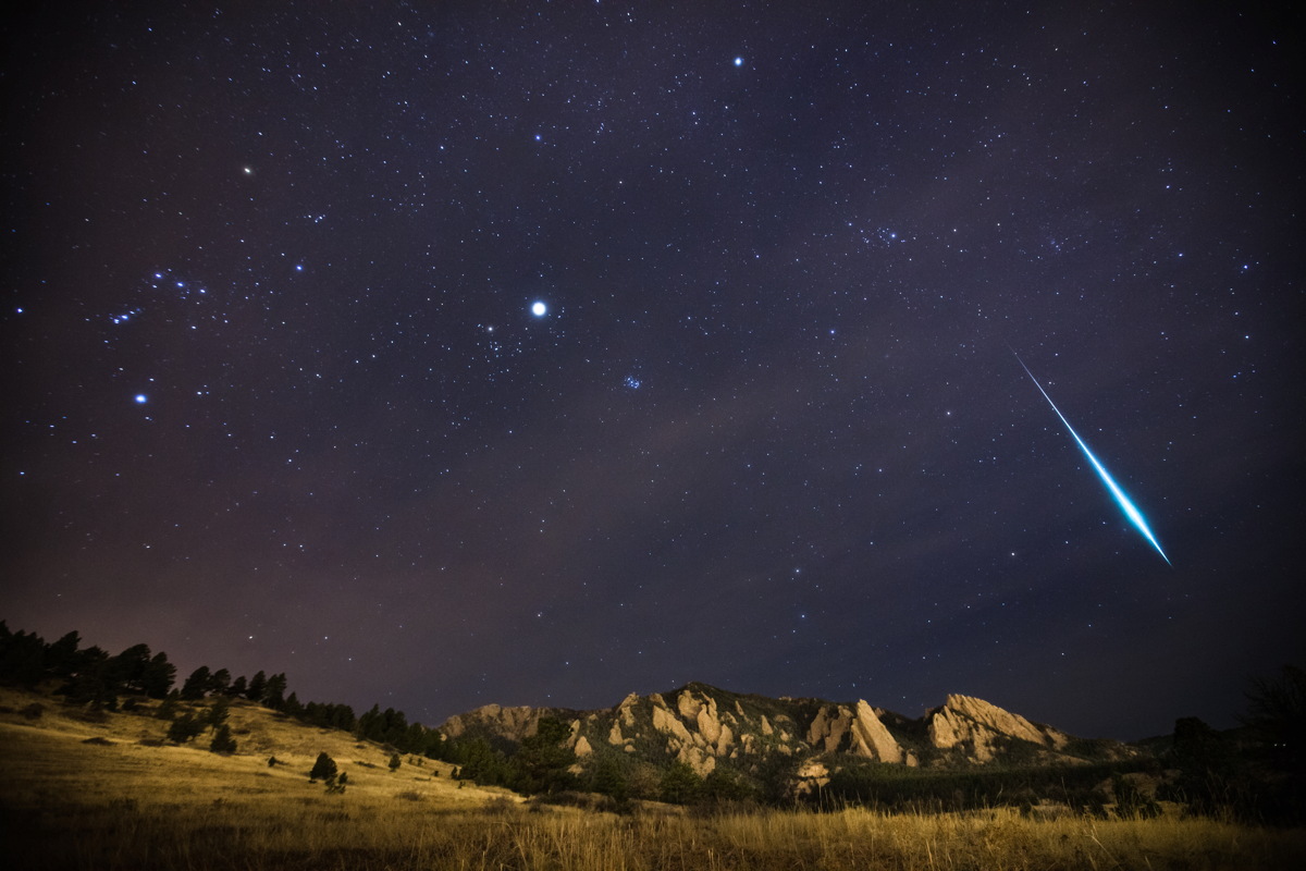
Geminid Meteor Shower | Boulder, CO | (c) Patrick Cullis
Not so bad, right? Now, let’s try an example using what we have learned. Let’s say there is a big meteor shower coming up (there really isn’t), and the peak time to see them will be Sunday night at midnight (12 am on September 21, 2015). For optimal viewing, we want the sky to be completely clear. A Front Range forecaster would use the hardly-colorful map below. But what is it?
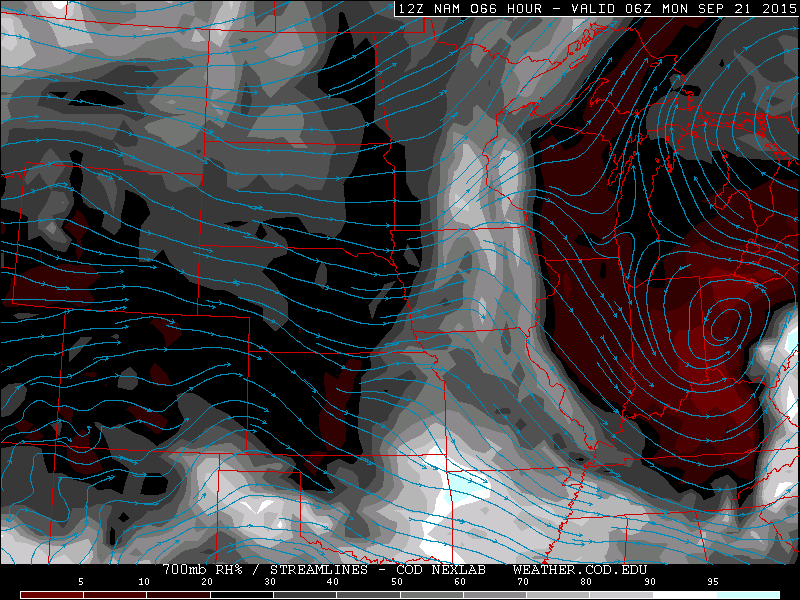
From what we have learned, we can this this map is from the 700 mb pressure level, a level that is lower to the ground than 500 mb. In Colorado, this is about 5,000 feet above the ground on the Plains. We use this level because clouds typically form here.
Next we see that this map contains RH% (which is relative humidity in percent) and wind streamlines (these just show the direction of the wind, which is parallel to the arrowed lines). Streamlines are not so important for our application, but relative humidity is. High values, say greater than 70% are a good indication that some or full-clouds may be present. Values below 30% suggest mostly clear skies.
Now the top panel of information. “12Z NAM” is displayed. This map is model output from the North American Model (NAM), run today at 12 Zulu time (6am Mountain Time). “066 Hour” indicates that the map is forecasting 66 hours out from the time it was run. “VALID 06Z MONDAY” confirms we are looking at the right time, since that would be 12am Mountain Time Monday, precisely when our meteor shower is scheduled to peak.
You may see why this map was a wise choice. It is the correct time and it shows relative humidity at a common level for cloud formation. But what does the data say about out meteor shower viewing in Boulder? Good things! The relative humidity over our area at the 700 mb level Sunday night is forecast by the NAM to be about 15%, allowing us to be fairly confident that clear skies will be present. There are several other maps and data fields, across various pressure levels we could check to increase our confidence in the forecast, but that discussion is for another time.
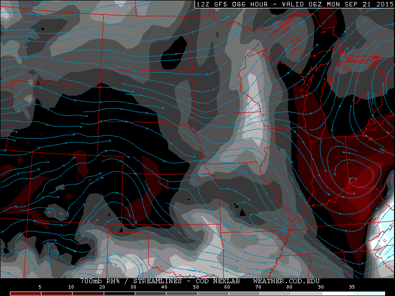
Just for kicks, an identical map is shown below, except now from the GFS model. It is always a good idea to compare model output; the more the better we like to say. This is another way to gauge uncertainty. Fortunately, the GFS also shows relatively humidity values near 15%.
The information presented above can be directly applied to all model weather maps we show on BoulderCAST, as we tend to use the same source for most of our maps. Other outlets will have the same important information displayed on their weather maps, but it could be slightly tweaked or in a different location.
We are very confident that skies will be clear Sunday night, so get out there and enjoy the hypothetical, technically non-existent, meteor shower!